How to choose a design for your villa or homestay booking website
Vacation rental website design for hosts: photos first, a look that fits your property, readable fonts, mobile first, and price and dates visible fast.
 Tai Pham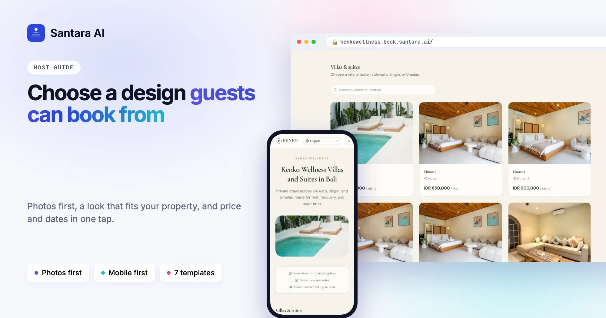
A guest who lands on your villa website decides in a few seconds whether to keep looking. They are not judging your fonts or your colour palette. They are asking simple questions: does this place look like the photos on Instagram, is it the kind of stay I want, and how much does it cost for my dates?
Good vacation rental website design answers those questions fast and then gets out of the way. You do not need a designer or a big budget. You need strong photos, a design that suits your property, and a page that a guest can use on a phone with one thumb. This guide covers how to choose a design for your villa or homestay booking website, step by step.
Start with your photos, not the design
Your photos do more selling than any design choice. Before you look at templates, sort your pictures.
- Pick the first image carefully. It is the one most guests see before anything else. Choose the photo that shows what makes your place different: the pool at sunset, the rice field view, the open-air living room. Not the bathroom, not a close-up of a pillow.
- Order the rest like a walk through the house. Arrival and outside first, then living spaces, bedrooms, bathrooms, and finally the area around you.
- Use daylight photos taken on a clear day. Turn on every light, open the curtains, and keep the camera level so walls look straight.
- Remove weak photos. Twelve strong pictures beat forty average ones. Dark, blurry or cluttered photos make the whole site look cheaper.
- Keep them current. If you repainted or replaced the furniture, update the photos. Guests notice when the room does not match.
If your photos are not good yet, fix that before you spend time on design. A simple layout with great photos will always beat a beautiful layout with poor ones.
Match the design to your type of property
A beach villa, a mountain homestay and a city apartment attract different guests, and the design should say "this is for you" at a glance.
- Beach and resort stays suit bright, open layouts with big photos and lots of white space.
- Design-led homes suit an editorial look with serif headings, like a travel magazine.
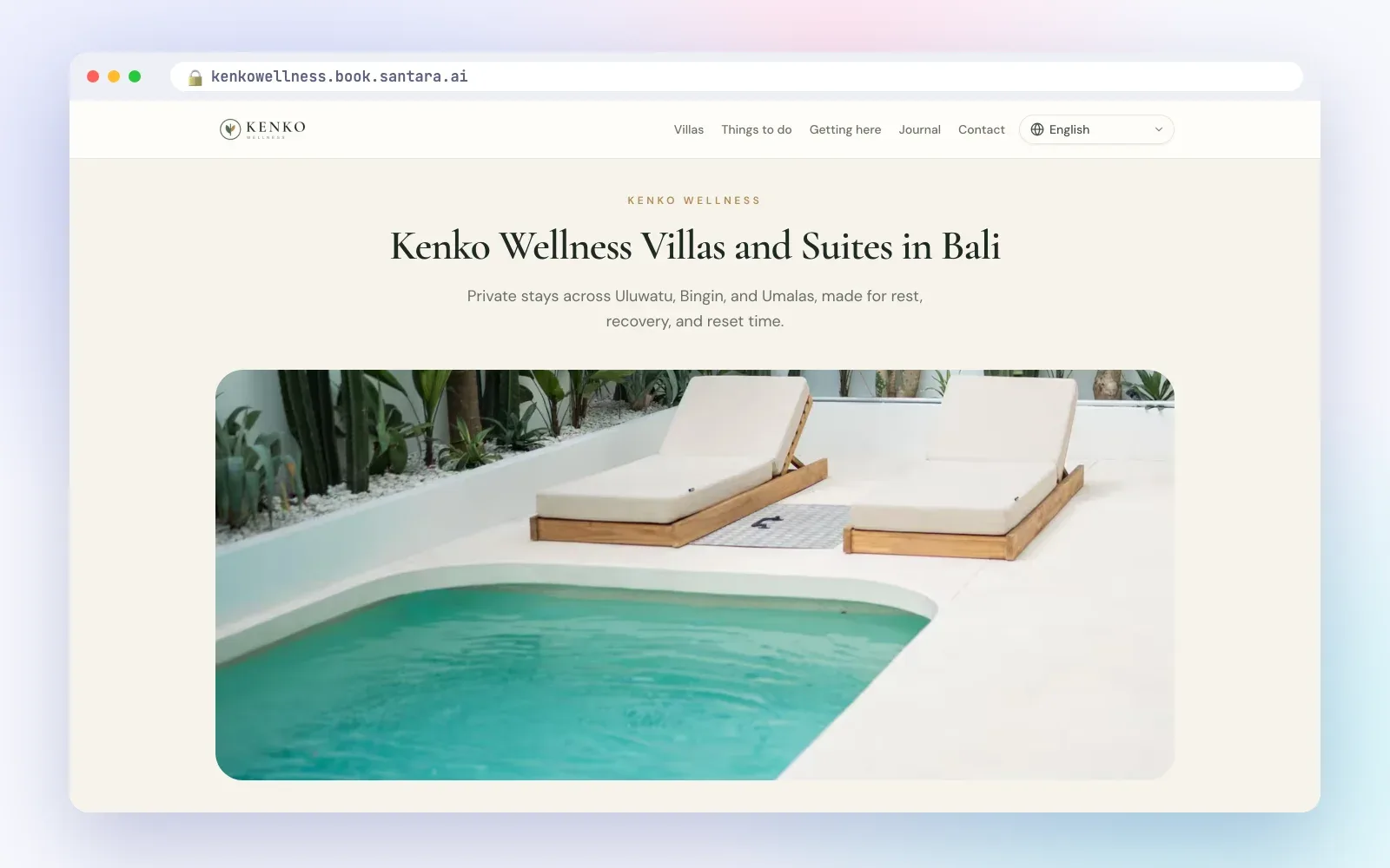
- Wellness, eco and countryside stays suit calm, airy pages with soft natural colours.
- City apartments and lofts suit bold, high-contrast pages that feel modern.
- Premium villas and estates suit elegant fonts, full-width imagery and restrained accent colours.
Ask yourself who books you most often: surfers, couples, families, remote workers, wellness retreats? Then choose the look that fits them, not the one you personally like best.
Take your colours from your brand or your property
You do not need a brand book. Look at your logo if you have one, or at the property itself: the wood of the deck, the green of the garden, the blue of the pool, the colour of the walls.
- Pick one accent colour for buttons and links. Use it consistently so guests learn that "this colour means book".
- Keep backgrounds calm: white, off-white, soft sand or a dark tone for an urban look.
- Make sure text is easy to read against the background. Light grey text on white looks elegant and is hard to read on a phone in the sun.
Choose fonts guests can actually read
Fonts set the mood, but readability comes first.
- Serif fonts (with small strokes on the letters) feel classic, warm or luxurious. They work well for headings on boutique, wellness or premium villa sites.
- Sans-serif fonts (plain letters) feel modern and clean. They work well for body text, prices and buttons, and for urban or minimal sites.
- A common, safe choice is a serif for headings and a sans-serif for body text, or one clean sans-serif for everything.
- Avoid script or handwritten fonts for anything longer than a few words.
Design for the phone first
Most guests look at your site on a phone, often after tapping a link in your Instagram bio or WhatsApp profile. Check every design choice on a small screen.
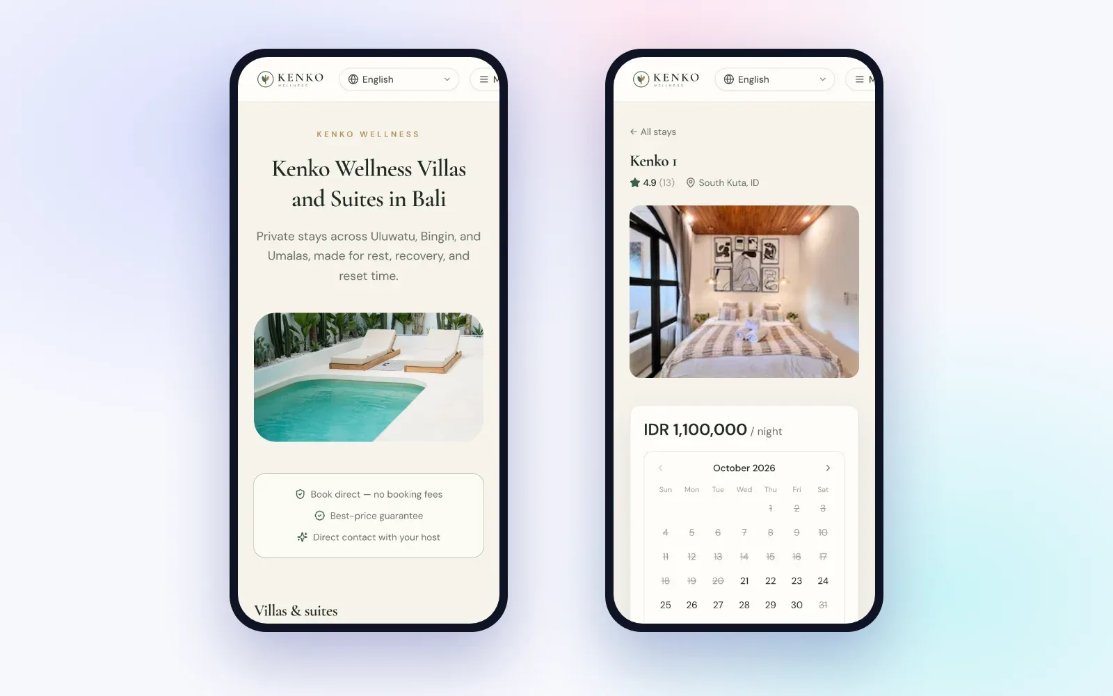
- Buttons should be easy to tap with a thumb.
- Text should be readable without zooming.
- The menu should be short. Five items is plenty.
- Large background videos can look great on a laptop and load slowly on mobile data. If you use one, keep it short and test it on a phone.
Show price and dates fast
The most common reason a guest leaves a booking site is that they cannot quickly find out whether the place is free and what it costs. Make sure a guest can see a nightly price on the listing cards and pick dates within one or two taps. Hiding the price until the last step feels like a trick, even when it is not.
Keep the home page focused
It is tempting to put everything on the home page. Resist it. A focused home page usually has:
Step 1
A hero image with a short headline that says what and where.
Step 2
A short trust line, such as your review score or how long you have hosted.
Step 3
Your properties or rooms, with photos and prices.
Step 4
A few reviews.
Step 5
A short "about us" and contact details.
Put longer content, such as things to do or how to get there, on separate pages. Every extra section pushes your properties further down the page.
The 7 Santara AI templates and who they suit
If you are comparing villa website templates, it helps to see the options side by side. With Santara AI, you start from one of seven templates. All of them work on phones and show your properties, prices and booking calendar. They differ in mood.
| Template | Look and feel | Best for |
| Coastal | Bright, photo-led hero with a booking card floating over it | Beach villas and resort-style stays |
| Boutique | Serif headings and a warm, magazine-style layout | Homes where the interior design is the selling point |
| Minimal | Clean and quick, lets photos and price lead | Hosts who want the shortest path to booking |
| Retreat | Calm, airy and nature-toned | Wellness, eco and countryside stays |
| Urban | Bold, high-contrast dark hero | City apartments and lofts |
| Luxe | Elegant serif type, gold accents, full-width images | Premium villas and estates |
| Gallery | Photo-first masonry grid | Properties with a large set of strong photos |
How Santara AI helps you get the design right
A direct booking site with Santara AI is built from the properties, rooms, photos and prices already in your workspace, so you spend your time on design choices, not on re-uploading content.
- Seven templates you can switch later. Change your mind and switch to another template without losing any content.
- Your colours. Set the accent, background, surface, text, muted and secondary colours.
- Fonts. Choose a heading font and a body font from 10 options.
- Logo, favicon and banner. Add your own branding.
- Hero image or background video. Pick one for the top of your home page.
- Home page sections you control. Reorder or turn off sections such as hero, trust, listings, about, reviews, FAQ, gallery, blog, contact and call-to-action.
- A visual editor with draft and preview. Work on a draft, preview it, undo and redo changes, and publish when you are happy.
- AI suggestions for your headline and tagline. Suggestions are written from your real listing facts, and you review and tick each one before it is applied.
Good to know
The design controls change how your site looks, not how your listings are described. Listing titles and descriptions come from your workspace and stay in their original language, even when the site is shown in another language.
FAQ
Which template should I start with?
Start with the one that matches your most common guest, then preview it with your own photos. Because switching keeps all your content, you can try another later.
Should I use a background video instead of a photo?
Only if you have a short, high-quality clip and you have tested it on a phone. A strong photo loads faster and often works just as well.
How many fonts should I use?
Two at most: one for headings and one for body text. Many good sites use a single clean font.
Do I need a designer?
Not to start. Good photos, one accent colour and a focused home page cover most of what a designer would fix.
Keep reading
- Direct booking website for vacation rentals: how to win repeat guests without leaving Airbnb
- Vacation rental website SEO
- From Instagram to direct bookings
Your first 3 months are free.
Join For Free